Visualizing U.S. Births
To check out the features in the chart/map tool Datawrapper, I reached into one of my favorite data sets: tallies of births and deaths in the U.S.
The data come from the National Center for Health Statistics, which is part of the Centers for Disease Control and Prevention. NCHS publishes data on births and deaths annually, albeit at different cadences.
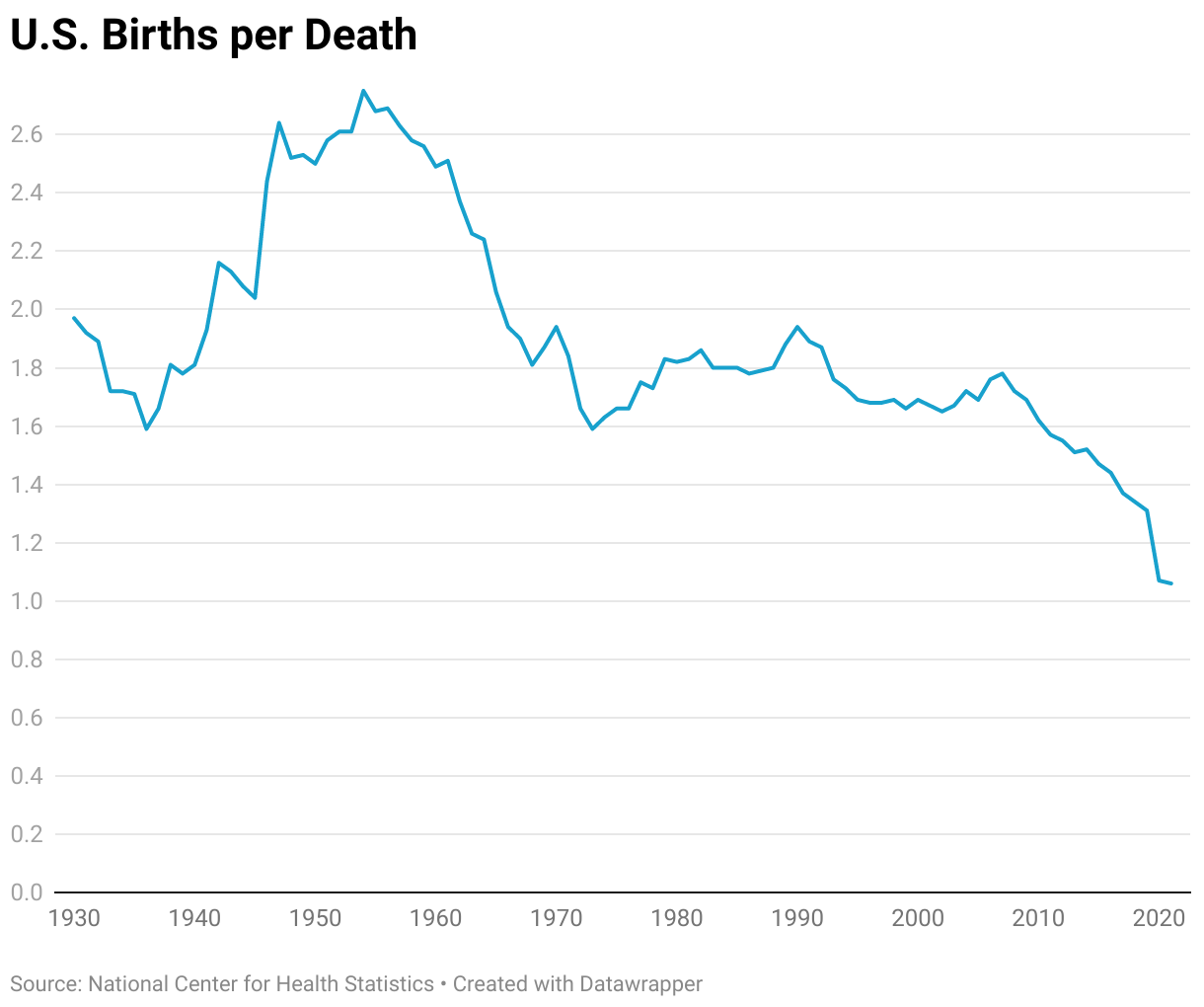
Datawrapper is intuitive and easily customized. For example, this simple Datawrapper line chart shows births and deaths in the U.S. since 1930:
Notice the Baby Boom following World War II, the relative dearth of babies born during the early 1970s (the cohort known as Gen X), followed by what demographers sometimes called the "echo boom" before Millennials became the preferred term for people born starting in the early 1980s. Generational changes in deaths became less volatile, increasing as the U.S. population grew, until the Covid-19 pandemic hit.
During Covid, the U.S. for the first time came close to having more deaths than births. The ratio of births to deaths fell to 1.06 in 2021 before rebounding:
Another way to understand birth trends is via the total fertility rate. The TFR is an estimate of the number of births that a hypothetical group of 1,000 women would have over their lifetimes, based on the age-specific birth rate in a given year. Here, I've converted the values to a per-woman rate and used DataWrapper's mapping tool to display rates by state in a choropleth map.
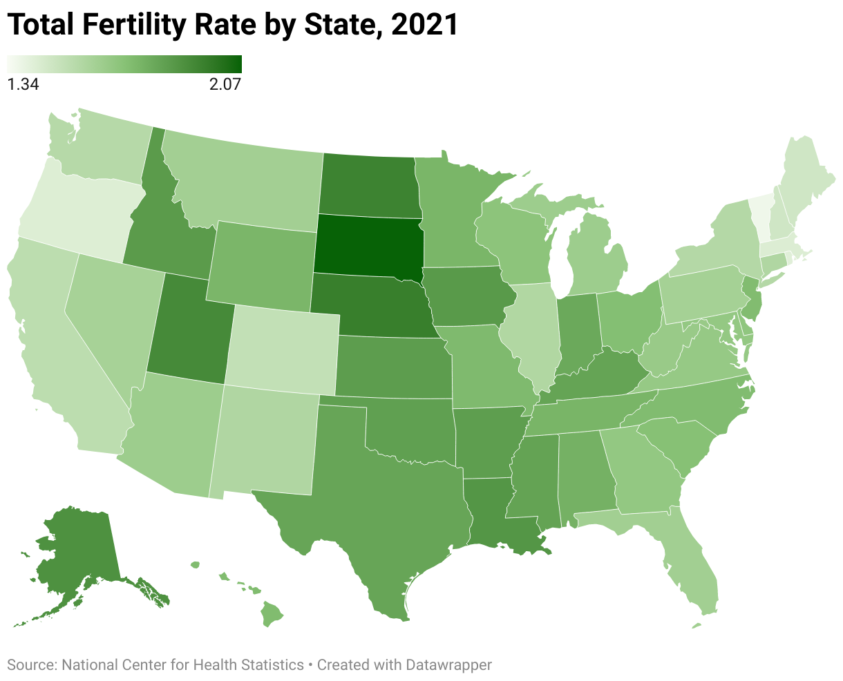
The so-called "replacement rate," or the average number of births per woman needed for the population to remain steady, is 2.1. The U.S. average in 2023 was 1.621 births per woman. Although every state was below replacement level, there was considerable variation fueled by differences in states' median ages and other demographic and cultural factors.
For more analysis on births, here are recent Wall Street Journal stories I've contributed to:
- Why the U.S. Fertility Rate Has Hit a Record Low (April 9, 2026)
- U.S. Fertility Rate Remains Near Record Low (April 23, 2025)
- U.S. Fertility Rate Falls to Record Low (April 25, 2024)
- A Visual Breakdown of America's Stagnating Number of Births (June 1, 2023)
- U.S. Births Increase for First Time Since 2014 (May 24, 2022)
- U.S. Population Growth, an Economic Driver, Grinds to a Halt (July 25, 2021)